The real work of creating a logo is not so much in drawing the graphic. The real work lies in understanding the place of the brand in the market as it exists and balancing that with the company's aspirations for the brand in the future. Between those two things lies a story that needs to be told in many ways. The graphic is only part of it. Want to know the rest of the story? Click here.
Businesses start up and die, but their logos live on forever in designers' portfolios.
BOOK DESIGN
LOGOS & BRANDING
THINKING CAP
PRECIS SMARTCARDS
9 - 22


This character was developed as an image logo for the Oklahoma City Ad Club Addy® competition. He represents the epitome of what David Ogilvy called "story appeal." Never heard of story appeal? Check out "Ogilvy on Advertising." You could Google that or you could hire me to do a seminar. Either way, it's a great story.
Illustration by Jon Goodell
The Oklahoma Small Business Development Center assists and promotes small businesses through a variety of valuable services. They help to even the playing field for the small business.
Cushing Chiropractic Clinic. Slipped disc, anyone?
This logo for Folger & Karim, an obstetrics/gynecology practice, is an elegant and stylized take on the traditional O+ symbol for female.
Asset Staffing focuses on personnel for the accounting and financial services industry.
Milamar manufactures molecularly-designed coatings and adhesives. The symbol represents the contents of two laboratory beakers combined.
Key-encryption certifier in Salt Lake City, dedicated to health care transactions. Sounds pretty arcane, doesn't it? The cross is classic health care. The data exchange is invisible. If we told you any more, we'd have to... well, you get the picture.
Special event promotional mark for KOMA during it's 50's/60's format era.
Illustration: Dan Birlew
This Denver, CO, firm needed an image that said ease, confidence and quality at a reduced price. The confident executive with his feet up on the "desk" is similar to an iconic James Dean still photo from the movie "Giant." The rough edge of the illustration and the rough Block type keep the overall image from being too slick. The tagline clarifies that they are not selling office space.
I'm pretty sure this one is self-explanatory.
Heroic, industrial-strength hamburgers in Oklahoma City's historic, former industrial and warehouse district, Bricktown.
Developed for Integrated Family Financial Services of Simsbury, CT, this mark combines an oval and a pine cone to represent a well-protected and growing nest egg.
Advantage Data Systems. Smartcard developer committed to portable, shareable and secure personal information.
This product logo for Advantage Data Systems, emphasizes connectivity and the personal nature of medical data.
Smartcard-based medical records for use in emergency rooms and EMS service providers.
Smartcard-based electronic wallet.
Precis Persona. Smartcard-based customer retention and loyalty programs.
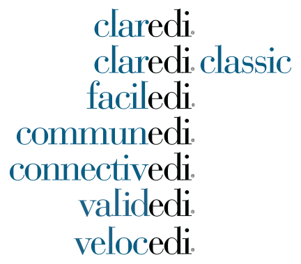
Clear Electronic Data Interchange. Claredi provided testing and certification for health care electronic transactions. The two colors emphasize the "edi" aspect of Claredi's business, while the backwards "l" sets up an implied connection between the serifs on the "l" and the "d."
After coming up with the name "Claredi" and a simple logotype that emphasized the core element of the business—electronic data interchange (EDI)—the convention for product names and product logos easily fell in to place. I believe the term for that is "serendipedi."
Twitter avatar for @DEVO140. Daily devotionals in 140 characters or less.
Originally developed for an Internet-based geographic information systems company in the oil industry. But when the company was acquired, I was able to keep the name and use it for my own purposes at www.realitygrid.com
Calgary, Alberta venture capital firm.
<
>
1990-NOW
Oklahoma City